Tip: Users can create personalized dashboard tiles utilizing the General ledger data in Accountability.
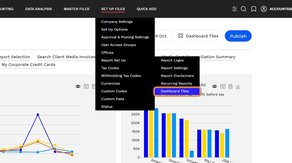
1. Navigate to Set Up Files > Report Set Up > Dashboard Tiles
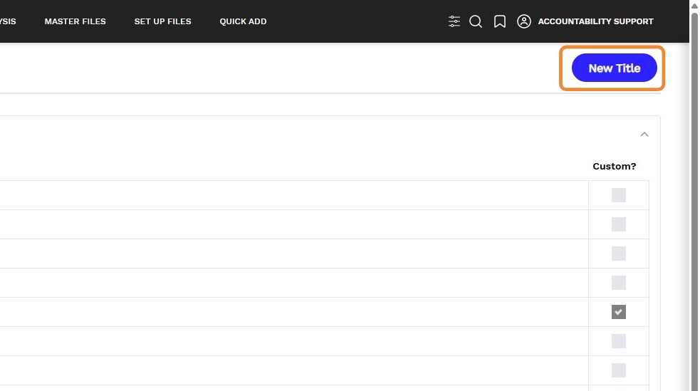
2. Click on the New Title button
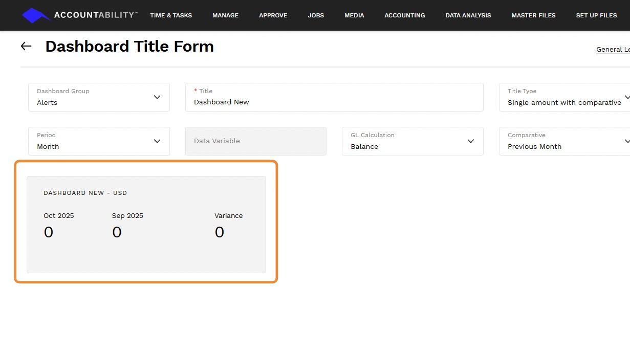
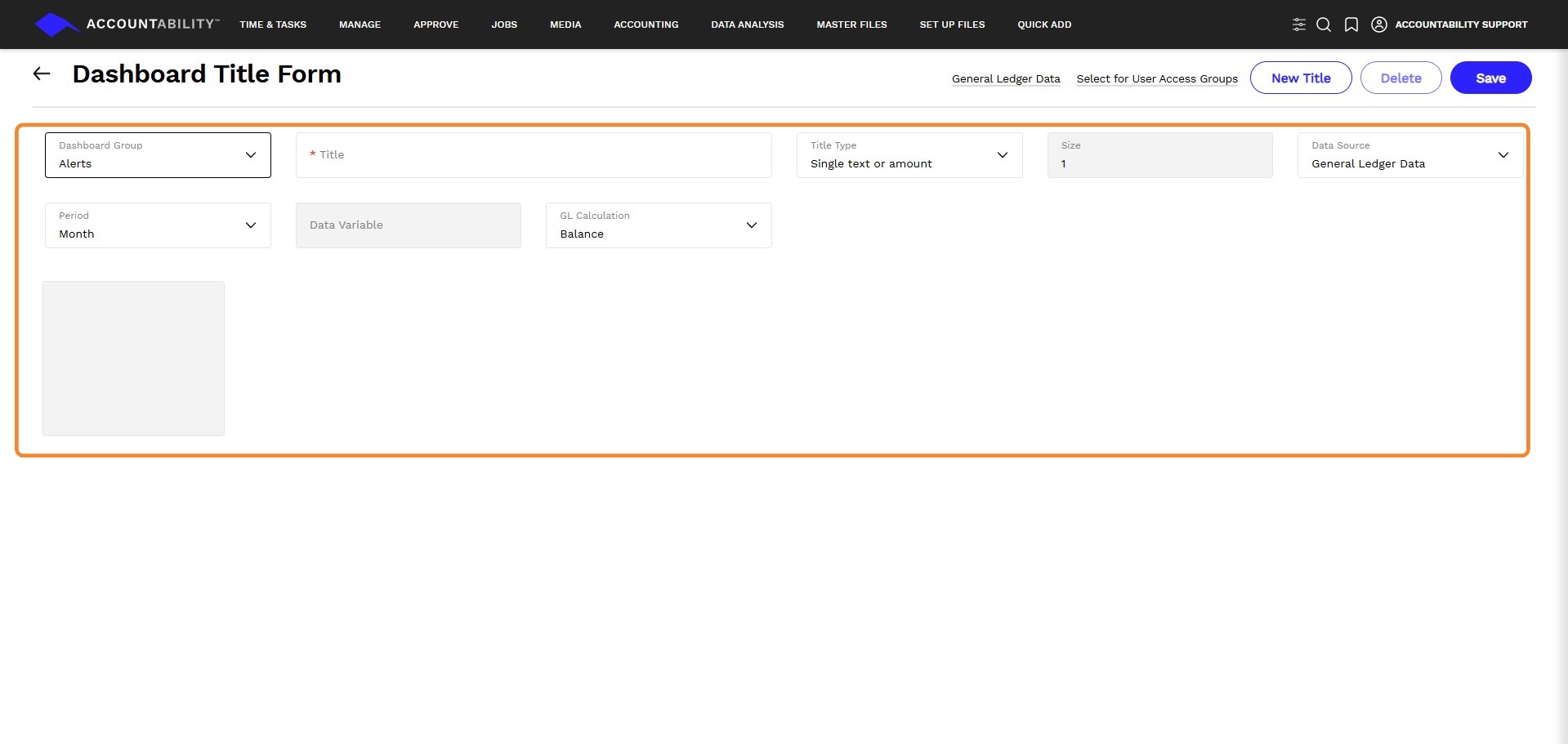
3. - Dashboard Group - Select the grouping that the new tile should appear when users are selecting tiles to add to their dashboard.
-
Title - Enter a name/title for the dashboard tile.
-
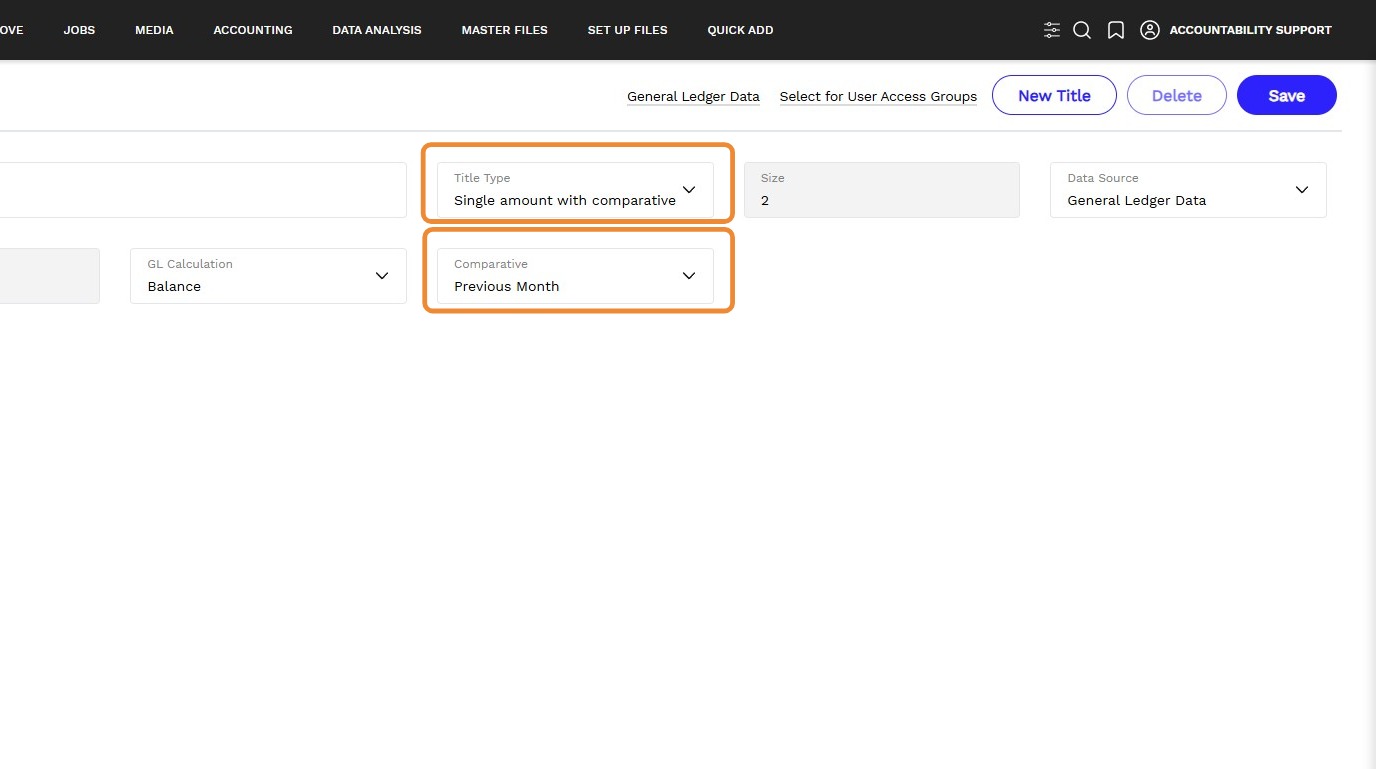
Title Type - Select how you want to visualize the data for this tile. You can choose from the following options: Single text or amount, Single amount with comparative, Line chart, bar chart, or pie chart.
-
Size - The tile size defaults based on the type selected. You can change the tile size for line, bar, and pie charts. As you change the size, you will see a preview of the tile size in a grey box at the bottom of the page.
-
Data Source - Select ‘General Ledger’. In future releases, we will enable additional data sources such as Jobs, Timesheets, Media, etc.
-
Data Variable - You can select from a host of variables, e.g., client or job, or choose from dissections of GL data stored in Accountability. The list of variables available is dynamic based on the tile type selected.
-
Period - Select the time period to be captured. Options include, but are not limited to Month, Year to Date, and Last 12 Months.
-
GL Calculation
Select one of the following:
- Movement -to base the chart on the movement in the selected GL Accounts in the period selected
- Balance - to use the Balances of the selected GL Accounts in the period selected
4. Comparative - This is only relevant/available if you selected the tile type Single amount with comparative.
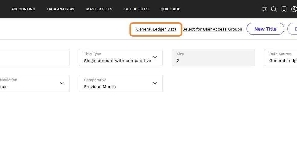
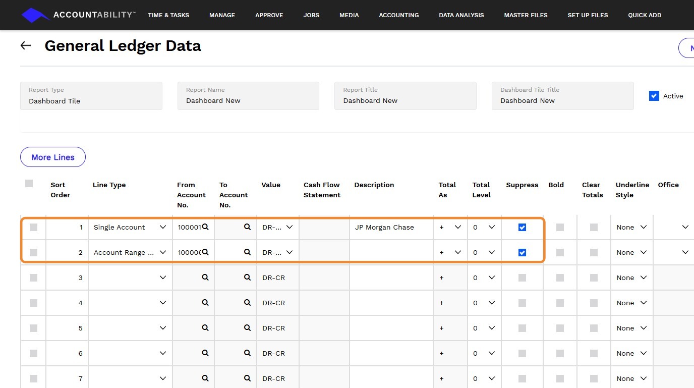
5. Define the source data – the GL accounts – that the tile/chart content should use. Select the General Ledger Data link - This allows you to calculate or select the account(s) or ranges of accounts to be included in the tile chart.
6. For example, you might want to just select the range of revenue accounts if you were creating a ‘revenue by client’ chart.
- Add lines to the chart to define the various content you want. For example, you might include one line for ‘revenue’ and another line for expenses.
- Check the Suppress box for lines you are only using to calculate an overall total to display on the chart. Any rows not checked as ‘Suppress’ will be displayed on the cart/tile.
- Note that the number of lines you can display will be varied/limited according to the tile type and data source you defined on the previous page.
7. Click Save to return to the previous page. A preview of your custom agency tile/chart will be displayed at the bottom of the page